
International Connect
International Connect is a local Christian student organization that helps incoming international students at Texas State University in San Marcos, Texas.
Role
UI/UX Designer
Tools
Figma
Figjam
Methodology
Research
Persona
Site Map
Wireframing
Prototypes
Usability Testing
Timeline
4+ weeks
Background
Currently, the organization has a website in which international students from Texas State are able to see more about the group, and what they’re like along with a few resources. However, the website is not too interactive and not up-to-date. Although there’s a tab for “Events” it only highlights pictures from past events, and doesn’t show upcoming events. There’s no interaction where the students can just show up to meet the mentors, with low barriers, aside from a sign-up form.
Goals
I would love to create a responsive website through which a potential international student looking through the site can get all the information they would need, to see if they want to check out the group or not. What events would they would be able to go to, and also help with the content on the site to make sense.
Empathize
I want to know what features would be most helpful for new, prospective students so that I can build a site that allows these prospects to stay up to date with schedules, meetings, and other relevant information.
Competitive Analysis
I decided to look at other organizations content on their sites that would be helpful for prospects. As I took a look at these three other organizations, I was able to find opportunities for International Connect to provide for prospective students.

As I researched these three other organizations, I found that their greatest strengths were the fact that they had their upcoming events up on the site. They were all very up to date from pictures, trends, and what events are coming up. It seemed like the organizations that did have social media were the much larger organizations (Girls Scouts and WAYA), and from the looks of it had more members and activity. However, something that was hard for each of the sites was not having a search bar. So if a user were to get on there, and looking for something specific, they would have to go through the pages to find it.
Research
Interview Questions
Summary
To gain better understanding, I interviewed three international students who are part of the International Connect. Even though they are already part of the organization, I wanted to see what their first impressions and what they thought about the site itself.
How did you hear about International Connect?
After browsing through the website, describe your overall experience and highlight specific features you liked or disliked.
What obstacles, if any, did you encounter while browsing through the site?
What features or improvements would you recommend?
Based on the interviews with the international students, they all mentioned how confusing the events page was since it didn’t have any information of upcoming events. Two of them mentioned, that it wasn’t really clear what the organization offered. And all three mentioned they would like to get connected with them without filling out the form every time.
Define
Affinity Map
I organized all my learnings on an affinity map to help group themes that emerged during interviews.

Personas
I created two personas based on my interaction with the students, as well as from talking to the mentors with the kind of students they meet.


Ideate
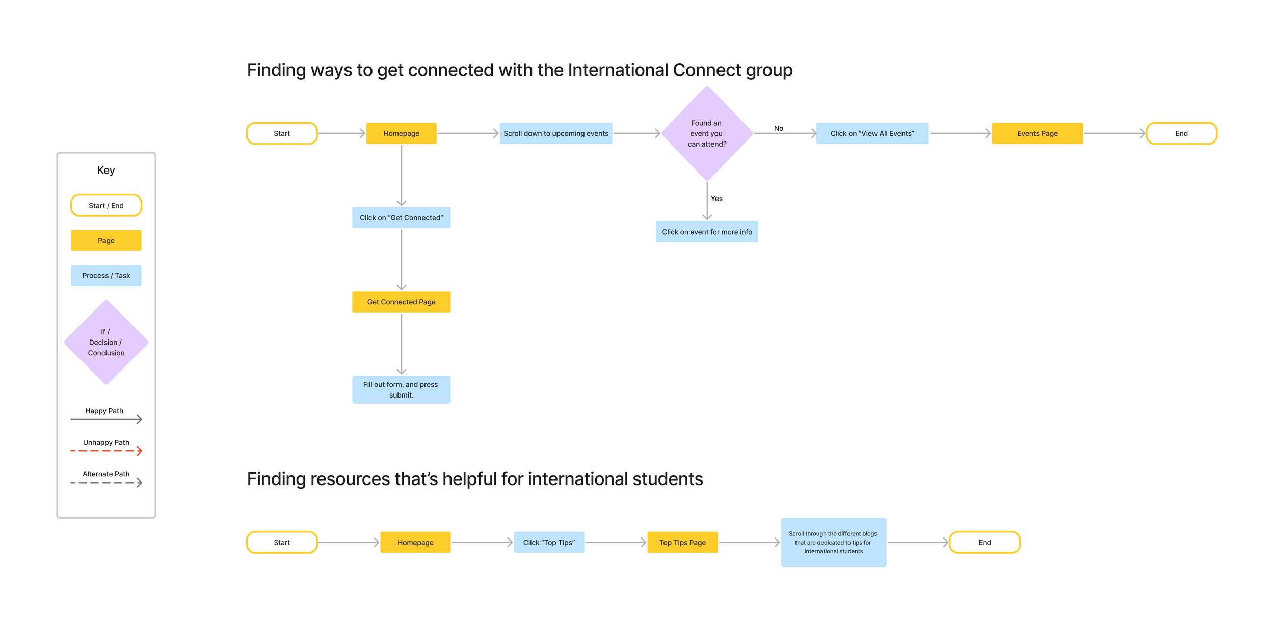
User Flows
After narrowing down from my research what would be most helpful for prospective international students, I created these two user flows. These flows include ways to get connected to with the organization and also helpful tips for international students.
Prototype
Low-fidelity Wireframes
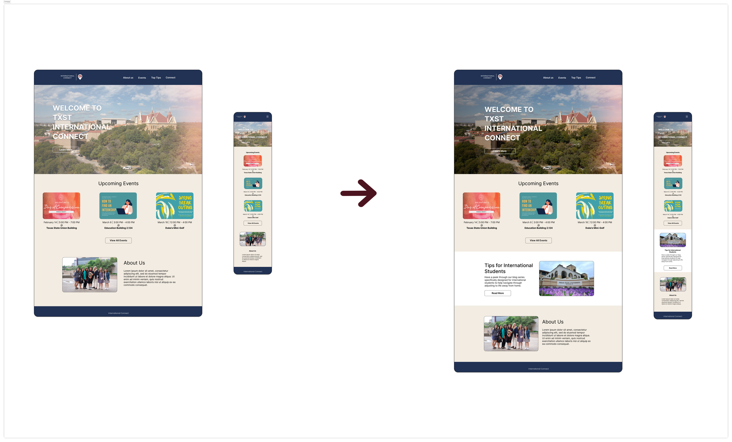
In the low-fidelity layouts, I wanted to stay within what was already there, but with a few added screens. I created both for web and mobile, to show the responsive aspect.


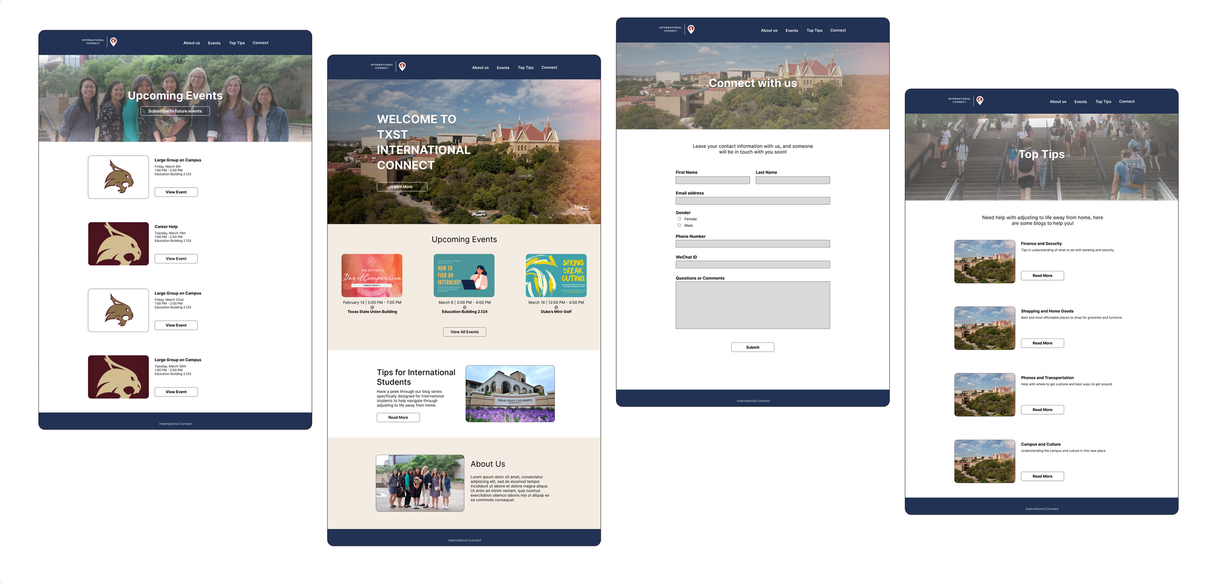
High-fidelity Wireframes
After some user testing from both the mentors and students of the group, I was able to make changes as I made the high-fidelity wireframes. Most were changes in the copy, and adding an extra screen for mobile to make the page flow make sense.


User Test
I performed another user test with the newest wireframes, with different mentors and international students using the same user flows of finding ways to get connected and finding resources that’s helpful for international students. Based on these tasks, I wanted to test the usability of the site and observe how users would interact with its features.
I added more content on the homepage to give more details about what the organization is about.
After receiving feedback about how hard it is to read the copy on header, I made changes to the copy and the images, by creating shadows.
On the “Connect with us” form, I added a section for gender, to help mentors with identifying.


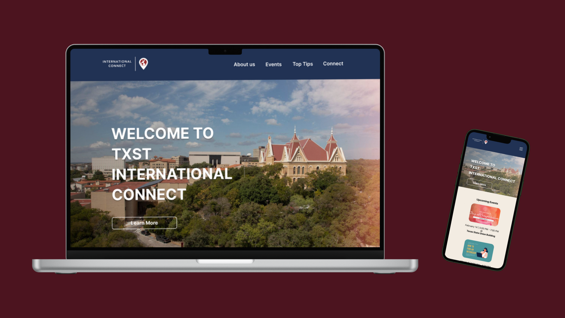
Final Design
While users thought the site was easy to use and intuitive, I learned just creating visual adjustments and copy on the page made the difference on the pages. I made these adjustments based on the feedback I was given.

Reflections
I was challenged to think about which user I was going to focus on, whether it was the mentors of the organization or the international students. However, with the amount of time I had with this project, I made the decision to think about what would be best for the international students.
If I did have more time, I would have figured out a way that would be best for both users.