
Cravelist
An app of favorite restaurant lists and reviews between friends.
Role
UI/UX Designer
UX Research
Branding Designer
Tools
Figma
Figjam
Methodology
Research
Persona
Site Map
Wireframing
Prototypes
Design
Usability Testing
Timeline
8+ weeks
Background
Restaurant reviews have become not only a platform to express oneself, but also to keep track of places to eat. However, when choosing a place to eat with friends or family it could be hard to narrow down. Review sites like Yelp or Google reviews do exist, but sometimes cutting through the noise of whether it’s credible or not. I want to create a product that would be between friends not strangers, with restaurant lists and reviews. A review from someone you know could be credible.
Goals
Creating an app that would be collaborative between friends’ personal restaurant reviews. The collaborative functionality would be invite-only, and each of the user may be able to categorize the restaurants either by types, costs, or ratings amongst one another. This product will be personalized to help satisfy the user to have a trusted source as the reviewer.
Empathize
Comparative Analysis
To understand how other applications handle their contents, I analyzed the strengths and weaknesses of three companies. This helped with looking at their different features that I wanted to add onto the product.

As I looked into these three apps, I was able to find that they are leaders in each of their respective focused areas (i.e. music streaming or marketing tool). Big features that they keep them innovative is the idea of collaboration and security. In these apps, it’s very clear that users know who they are collaborating with, or who is seeing their posts.
Research
I interviewed five participants because I wanted to learn about users’ motivations and methods, in how they decide in choosing a restaurant to eat with friends. I hoped to gain their perspectives and gain insights to what users do.
Interview Questions
Can you tell me about how you chose the restaurant the last time you went out to eat with friends?
Were there any apps you used in order to make the decision?
What were your deciding factors for choosing the restaurant?
When searching for new restaurants, do you rely on specific apps or sites? Please elaborate on your process.
Have you ever chosen a place to eat, just recommended by friends?
Did the restaurant live up to their recommendation?
Do you have a list of restaurants you like? How do you keep track?
Summary
Based on the interviews, participants showed ratings and reviews, dietary restrictions, and location as the top deciding factors when choosing a place to eat. When participants added the factor of their friends, health conscious options became the top consideration. Participants also preferred their friends’ reviews and ratings more than reviews they found online.
Define
Personas
I analyzed the interview data to create personas, to help guide the focus on target users throughout the remaining design process. The personas are based on greater understanding of potential user’s desires, goals and pain points.


Ideate
Sitemap
I created a visual representation of the app’s structure, to help understand a clear navigation and content organization.

Task Flows
With these insights, I moved forward to developing two task flows that were aimed to creating a restaurant list and collaborating with other users to create the restaurant list.


Prototype
When I initially made the low-fidelity wireframes, they were inspired by the apps I explored during the comparative analysis. The intent behind it was to have them closely resembling to screens that users would already see from other apps. Another factor was the collaborative aspect of those apps, which I wanted to make simplified.
Once I received feedback from the low-fidelity wireframes, it gave room for opportunity to create new screens since an app like this does not exist in the industry yet.


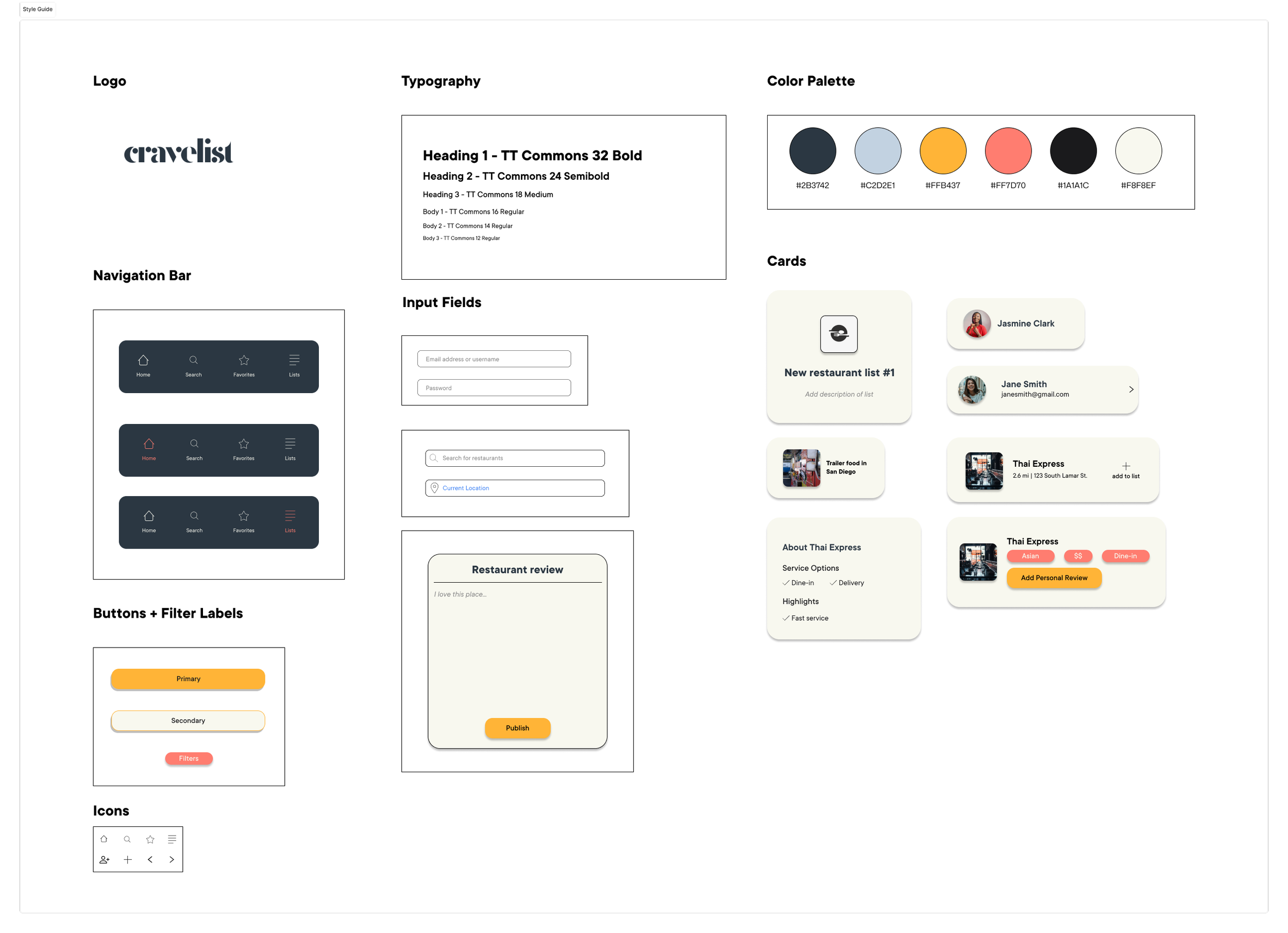
Style Guide
After creating the layouts, I established a style guide for consistency in visual design of the app. When I thought about the branding of Cravelist, I wanted something modern, playful and simple. With the logo, I kept it simple with a serif font, that would be the opposite of the overall font that I used for the entire app - which was sans serif. In choosing the color palette, I wanted to make sure that users to know they could trust us, so I kept it simple with a variation of blues. I added pops of colors that wouldn’t take away from the overall idea of being “trusting and loyal” by adding a variation of pink and yellow, which also kept it playful.
User Test
I performed another user test with the newest wireframes, with all new participants based on the same task flows. I tried to determine whether the app’s design was intuitive and met the user’s needs. From this, I was able to gather three main feedback points.

Participants wanted to see how it would look to change the name of the list, description, and image of the list in order to help distinguish from other lists.

Adding the address and how far it is from the user’s location in the search page, so user is able to identify that this is the place they’re looking for.

When choosing collaborators for the list, being able to highlight who they are when they’re tapped on the app.
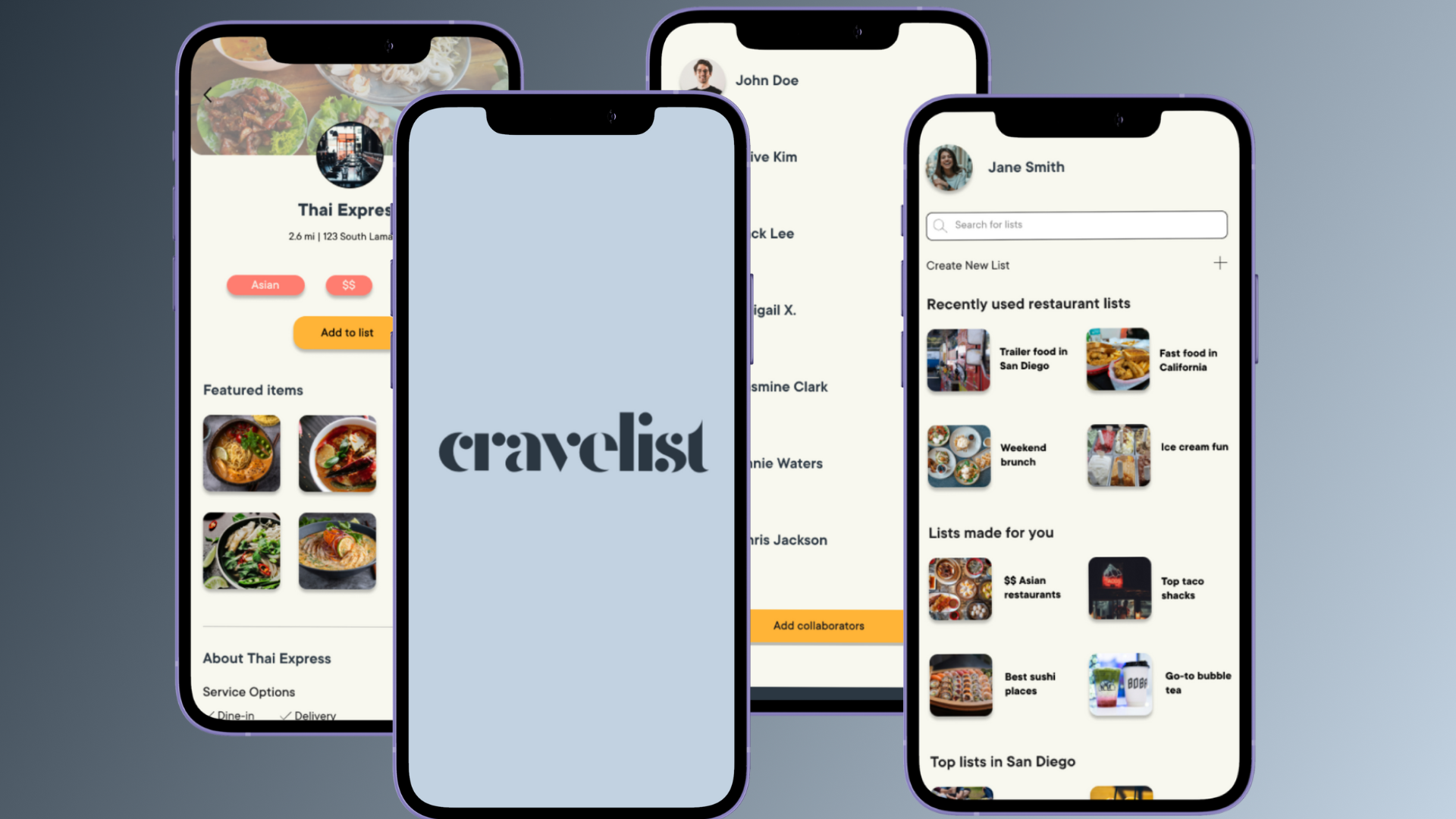
Final Design
Based on user feedback, I improved the wireframes and incorporated interactions to make going through the app more smoothly.


Reflections
If I had more time to work through this project, I would’ve probably spent more time on the design visuals, specifically the logo. I would have also loved to add a map on the the restaurant pages and give that visual for the user, and also think through the WCAG accessibility standards for the app.
Throughout the process, I learned to really think through from the user’s perspectives. Working through this project taught me how important it is to intentionally think through every element and feature of the project and how it plays a role in the end result.